

Day 76: Lone on the Sea
2026-04-23
Hello! I've been posting a lot of recent photos to the website this month, and I'm keeping the old ones just in case I'm not able to get out and about that day.
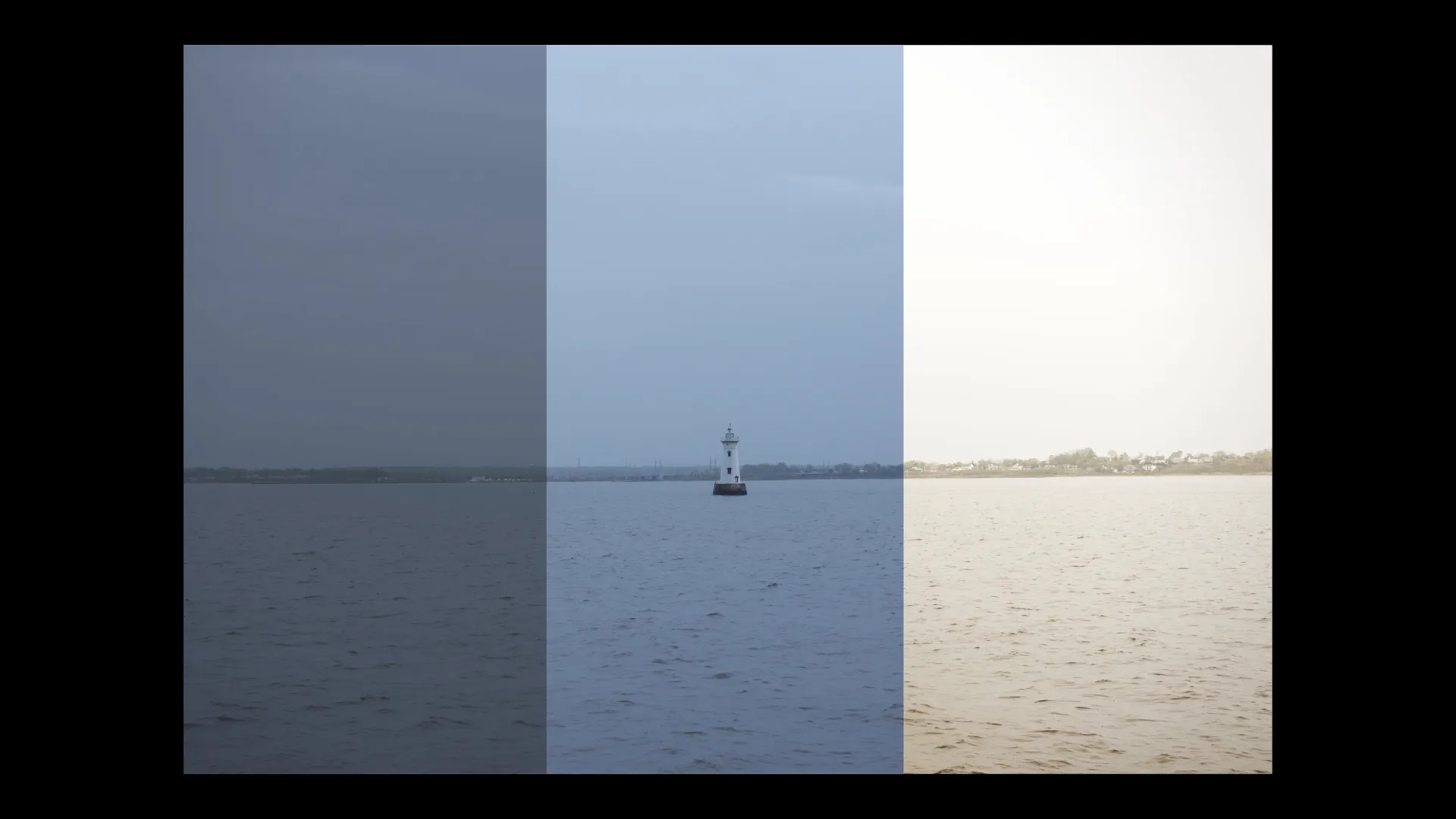
I took this photo yesterday, out on the water in Raritan Bay. I'm not able to ID this lighthouse with confidence, but I'm pretty sure it's the Great Beds Light.
I could talk about the several antics that I got up to that day, including a few silly games with a deck of cards (seriously, play Go Fish or Solitaire without shuffling the deck ever — it's hilarious), but I'd like to talk about my heavy editing process.
Every time I publish a monochrome photo, you're seeing the result of heavy editing. It is stylized to emphasize texture and shading, not color. Other photos, even if they seem otherwise normal, will have the lens vignette and distortion reduced (or eliminated) through editing.
Today's photo is recolored, because the original photo showed a dreary scene of rain and fog. That's accurate, sure, but it's not what I saw, and it's not what I felt.
The image in my head a split second after taking the shot did not look like the original file out of the camera. It never does. So I edit it to look more how I imagined it. Any program can do this, but I sometimes choose different programs depending on the style I'm looking for. A lot of times, I prefer the free software over the paid options!
Anyway, I've shown three versions of the same image. The first (left) is as close to "raw" as I can reasonably get — very little contrast, just a big file of data for any editing software to look at and say "I can do something with that". It's not really in a viewable state at first. In the middle is some default settings applied to make it look more reasonable. But on the right is the stylized and recolored image that I've created by pushing a few buttons and moving a few sliders.
Despite all this, I don't actually recommend heavy edits as a go-to for photography. There's something to said about accuracy and preserving image integrity. Where you draw that line in the sand is very subjective (and people tend to put that moral line just beneath their own work to justify themselves).
Some people take it right out of camera and present it then and there ("straight out of camera", or SOOC). Some people use algorithmic behavior to blur parts, erase distractions, and some use AI to generate new backgrounds and new subjects. The line gets very messy indeed. There's no right choice.
I'm joking, of course. Don't use AI generation.
Finally: photography is not boring. This YouTube video gives tips on how to take great photos in boring places, and it's one of those videos I'm glad to have found early on.
Thank you for visiting this blog! Reply by email, subscribe via RSS, or join the 1Day1Photo newsletter, where you can get this photo a week before the internet does :-).
Cheers,
David
Technical info, for nerds
- Camera: Nikon D7200
- Lens: Nikon AF-S DX Nikkor 35mm F1.8G
- Focal length: 35mm
- Exposure: 1/1250 sec shutter speed, f/2.8 aperture, ISO 100
- Edited with: Affinity